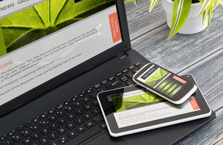
The sails are loose after being locked up in your cabin for more than a year, and you sail again with full wind in the back! With a ship’s hold full of new ideas, inspiration and new crew, experts are already heading towards 2022. In this blog, you’re going to track down undiscovered web design trends for 2022 and occasionally take a trip into familiar territory.
In previous years, there were a lot of trends that influenced the layout of the website.
Examples include asymmetry, harsh colour contrasts, and various illustrations and animations. In the coming year, web developers expect the focus to be shifted more towards the content, and those complex layouts will make way for a more readable variant. Below is an overview of the upcoming web design trends for 2022:
Dark Mode and Low Light UX Web Design
Dark mode means nothing more than that the screen’s background is dark, and the texts are light. With light mode, this is obviously the other way around. The contrast between reading text and background colour must be sufficient to make it pleasant to read with both shapes. The background colour does not necessarily have to be black; this can be any ‘dark’ colour. The implementation of this varies enormously.
At the moment, dark fashion is chosen mainly because it can be aesthetically pleasing and distinctive. The fact remains that most websites and applications use a light background, which is why dark mode is often just a little more unique.
That’s not the case. The demonstrated differences between light and dark modes have been verified. Still, many factors influence the result, such as eye abnormalities, colour blindness, and the type of screen you look at. On average, dark mode is slightly better in dark rooms and light mode again in bright spaces. The optimal solution is, therefore, to offer both. That is why, for example, large applications such as Facebook, YouTube and Instagram offer both. For websites, this will not really be an option for the time being because then the development costs will be significantly higher. For the time being, it will still be purely a visual choice for web design, and therefore dark fashion is definitely among the unique website design trends that we will also see a lot in 2022.
Rotating Animations
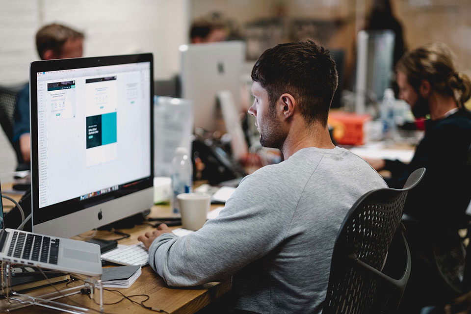
In recent years, we have seen a huge rise in illustrations and animations in the layouts of websites, especially to be distinctive. Nothing wrong with that, right? True, only where it goes wrong is when illustrations, photography and other graphic elements get in the way of focusing on the content.
Entrance animations provide the dynamic feeling; think of a header or text block that slowly appears in the picture from bottom to top. Often this goes hand in hand with reveal animations.
Reveal animations are applied to images, such as when you scroll in a website, an image appears. This can also be applied to background images, for example, to make the page look a lot more interesting. By using animations, one can fill the lack of content. Well-timed and placed animations fill the website.
Dynamic scrolling
Parallax scrolling is a trend that came to life a few years ago. It is a technique in computer visuals in which background pictures move slowly along the camera than foreground pictures, generating an illusion of depth in a remote 2D scene. For a while, this technique was a huge hype. In 2022, however, this is different. Parallax scrolling used to be implemented for almost every entire website with every element; it is now used on a much smaller scale. Parallax Scrolling is now used more on a detailed level to make a website more dynamic or create more depth and experience without distracting a visitor from the website.
Impactful, engaging stories
The story you tell matters to users. Illustrations are another popular digital trend used by companies from a variety of industries, including leading brands such as Buffer, Pipedrive, Bolt, and others. Even giant Google is constantly collaborating with the best Website Design & Web Development Services Companies to create creative illustrations for its products and services. An illustration is not only what accompanies the story. That’s the story itself.
Digital illustration is a way to tell your brand’s story without saying a word. It conveys the mood and personality of the brand, allowing customers to feel like they are becoming part of something more than just an algorithm for generating revenue by participating in this digital experience. Digital illustration in the user interface design for mobile applications and websites helps to establish emotional connections with users and increase their loyalty.
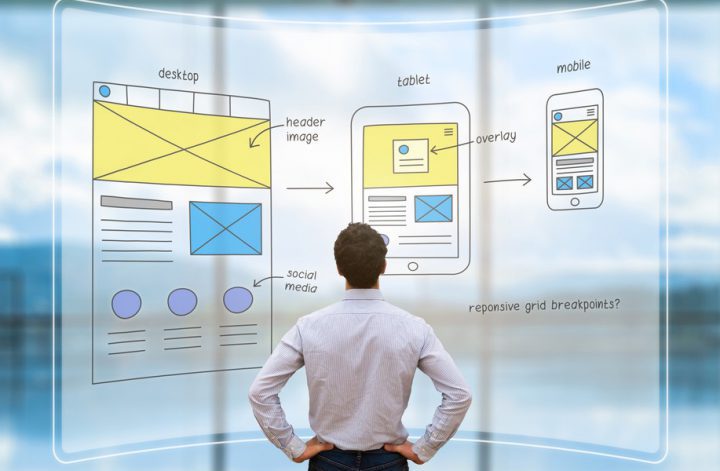
Responsive pages
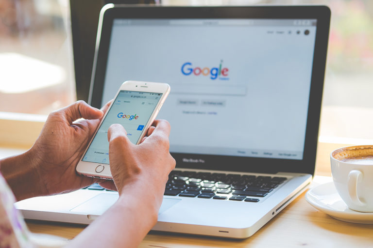
Do not take into account multi-device browsing, in 2021, is one of the most frequent and penalizing tools for anyone who wants to have a good reputation and a professional presence online.
The spread of high-performance and technologically advanced smartphones has led, in recent years, to an exponential increase in users who spend more and more time browsing via mobile phone rather than on desktop computers. Creating a responsive website, perfectly accessible on all devices, with a fast-loading time is an essential requirement to encourage visits and online sales
Neomorphism
The term neomorphism came from amalgamation of two words, “skeuomorphism” and “new”- a design with components that emulate real objects. Skeuomorphism was famous in the 2000s, and recently the latest version of it has launched- neomorphism.
Neomorphism is a trend that is actively gaining popularity in interface design this year. This approach is also called a “soft interface”: due to the softness of shadows and the roundness of lines, the design looks like something between skeuomorphism, popular in UI design in 2012-2013, and flat design, which was widely used in websites and mobile applications later. In 2019-2020, more and more designers prone to creative experiments demonstrate the concepts of user interfaces in this style, not too realistic, but also not quite flat and simplified, with notes of volume and softness of forms. The practicality of these modern web design trends is hotly discussed in design circles, and opinions on its account are extremely ambiguous. However, as a new creative manifestation in the field of UI design, it deserves attention.
Cartoon Characters
Illustrated characters and handmade graphics have become an important trend for homepage designs. The unique characters add flexibility by smart placement and positioning to develop a memorable experience.
Another feature that one can highlight with cartoon characters is the call-to-action button. Clean illustrations load more quickly as compared to photos.
